Hey guys! Look what came in the mail today? It's Zoya's spring 2014 collection! I fell in love with all the soft colors, so I decided to swatch it right away for you. Plus the sun was out, so yay. :)
Dot, 4 coats: pale pink creme. It's a lovely sheer pink, but the formula was really off. It's patchy and hard to even out. The opacity was okay at three coats, but I needed a fourth coat to even everything out. The consistency is on the thicker side, so it's better applied in medium/thick coats.
Cole, 4 coats: pale, creamsicle orange creme. Love this one! It is a little streaky, which is why I did a fourth coat to even it out. Otherwise, it looks decent in three. If you like the color, it may be worth the work. The final result is so soft, creamy and shiny. Plus, I think it's a very flattering shade of orange.
Brooklyn, 3 coats: pale metallic gold. The overall finish has a satin-like look to it. The formula is great, as is the opacity. It's good to go in 2 coats, but I used a third coat to straighten out my brushstrokes. So yes, brushstrokes are visible on this one.
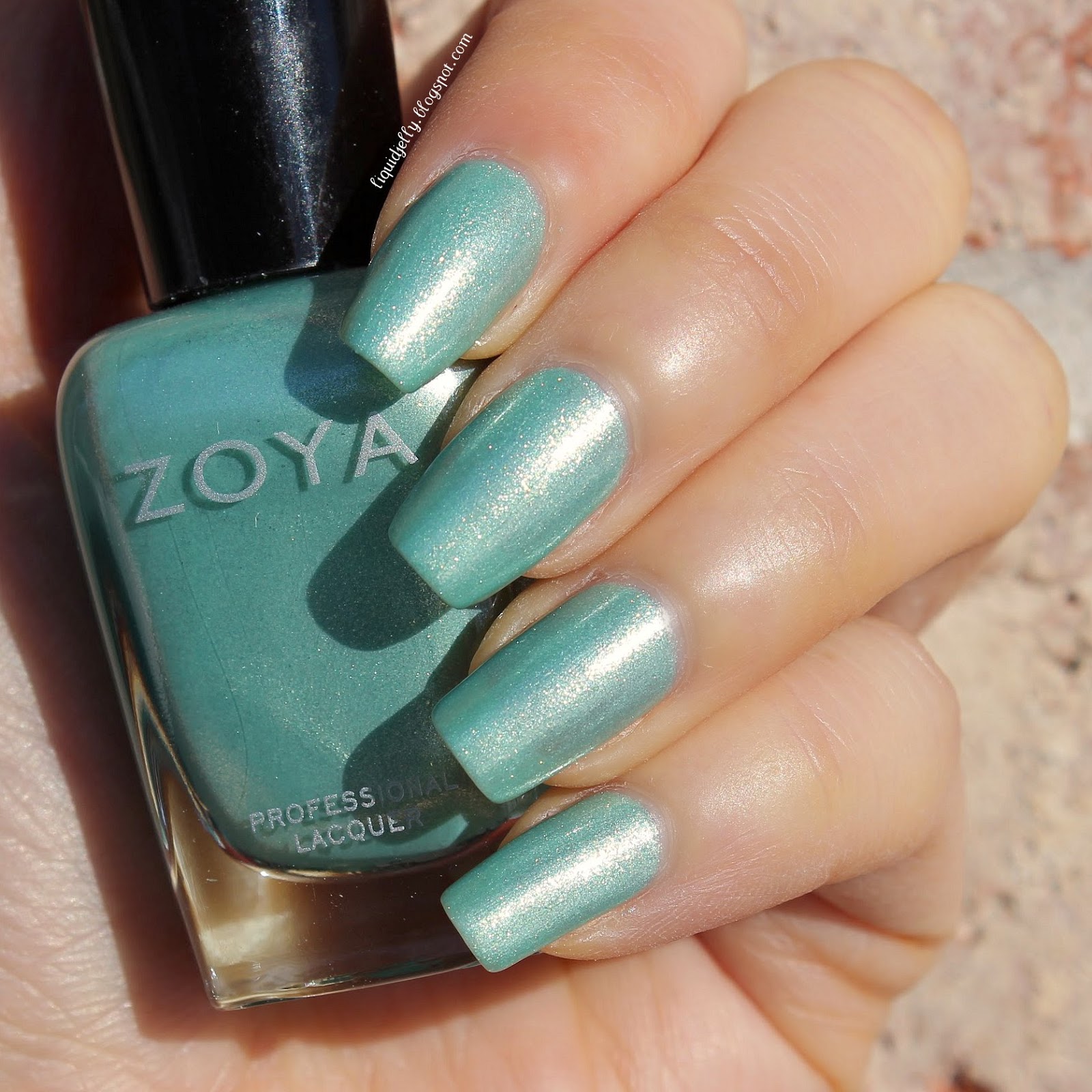
Dillon, 3 coats: pale, seafoam green with gold shimmer. It has a sheer base, but I thought it looked okay at 3 coats. My pics make it look sheer, but there wasn't much VNL in person. The formula is spot on for this color. It applies flawlessly without much trouble.
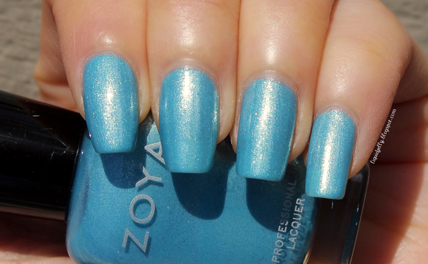
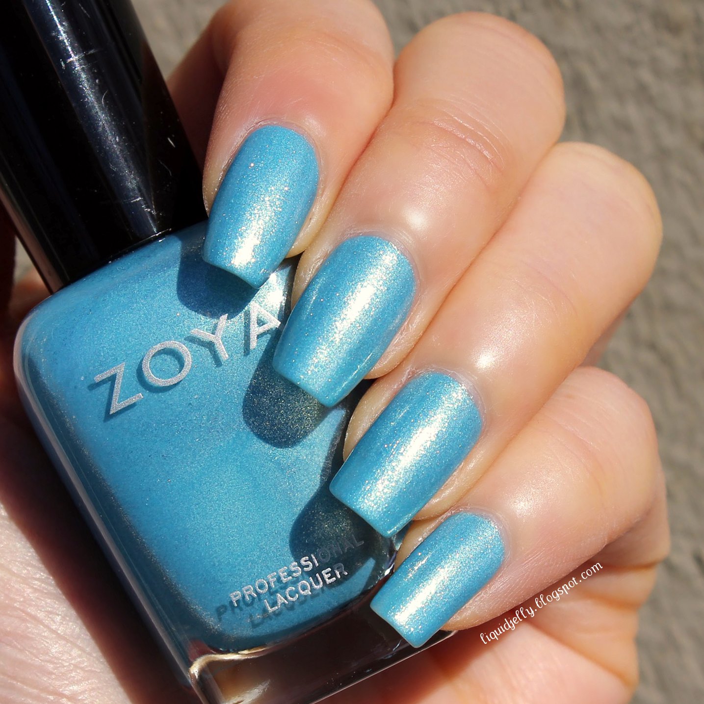
Rebel, 2 coats: sky blue with gold shimmer. Great formula and opacity on this one! This color makes me want summer so bad.
Hudson, 3 coats: lavender with gold shimmer. This is hands-down my favorite from this collection. It's gorgeous! If you look closely, you can also see some multi-colored shimmer in the gold as well. It's really something in the sunlight. The formula was excellent as well.
Monet, 1 coat over Cole: clear-based glitter topper with medium, multi-colored cellophane glitter. I love this over Cole the best! The two make such a yummy combination. I also like it over Hudson, but I didn't care for it over any of the other colors. You can see it swatched over the other shades below.
The cellophane glitter, for the most part, looks and acts like an iridescent glitter. The consistency was a bit gluey, but it still applied well. The glitter tends to sink into your base color, so I recommend waiting for your base to dry before applying.
 |
| 1 coat over Hudson (sunlight) |
 |
| 1 coat over Hudson (shade) |
 |
| 1 coat over each Awaken shade (sunlight) |
As you can see, Monet generally looks best in the shade than in direct sunlight. This is usually the case with iridescent glitters. It also doesn't play well with Brooklyn (gold), as the glitters dig into the color and create wrinkles. Not good. :/
Verdict: Overall, it's a nice collection, but Zoya's done better. The cremes were generally sheer and uneven. However, all the others applied nicely and had decent coverage. Monet is a pretty topper when layered over the right colors. It's very soft, so it tends to disappear over certain colors. My favorites from this collection are Hudson and Cole.
Availability: Both Awaken and Monet are now available online at Zoya.com. Awaken shades retail for $9 each and special edition topper Monet retails for $10.


No comments:
Post a Comment
Thank you for taking the time to comment! Please do not leave any links or inappropriate comments, as they will be deleted. Otherwise, I appreciate and read every single comment, so please don't be shy! :)